
由于科研需要,早已不复年轻的我又要从头开始学习一门新的语言——Python。由于老年痴呆愈发严重,只得将各种学习笔记记录在此。本文主要针对Python中画图部分展开,包括plot、subplot等。
1. plot
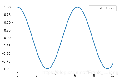
plot 用以展示变量的趋势变化。plot() 函数的本质就是根据点连接线。根据x(数组或者列表) 和y(数组或者列表)组成点,然后连接成线。
简单示例如下
1
2
3
4
5
6
7
8
9
import matplotlib.pyplot as plt
import numpy as np

x = np.linspace(0.05, 10, 1000)
y = np.cos(x)

plt.plot(x, y, ls="-", lw=2, label="plot figure")
plt.legend()
plt.show()
1.1. 颜色控制
要想使用丰富,炫酷的图标,我们可以使用更复杂的格式设置,主要颜色,线的样式,点的样式。默认的情况下,只有一条线,是蓝色实线。多条线的情况下,生成不同颜色的实线。
| 字符 | 颜色 |
|---|---|
| ‘b’ | blue |
| ‘g’ | green |
| ‘r’ | red |
| ‘c’ | cyan 青色 |
| ‘m’ | magenta平红 |
| ‘y’ | yellow |
| ‘k’ | black |
| ‘w’ | white |
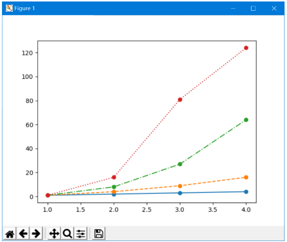
1.2. 线形控制
| 字符 | 类型 |
|---|---|
| ’-‘ | 实线 |
| ’–’ | 虚线 |
| ’-.’ | 虚点线 |
| ’:’ | 点线 |
| ’ ‘ | 空类型,不显示线 |
例如
1
2
3
4
5
6
7
8
9
10
11
12
13
14
15
16
import matplotlib.pyplot as plt

x = [1, 2, 3, 4]
y1 = [1, 2, 3, 4]
y2 = [1, 4, 9, 16]
y3 = [1, 8, 27, 64]
y4 = [1, 16, 81, 124]
# 创建一个画布
plt.figure()
# 在figure下线
plt.plot(x, y1, "-o") #实线
plt.plot(x, y2, "--o") #虚线
plt.plot(x, y3, "-.o") #虚点线
plt.plot(x, y4, ":o") # 点线
# 展现画布
plt.show()
绘制效果为
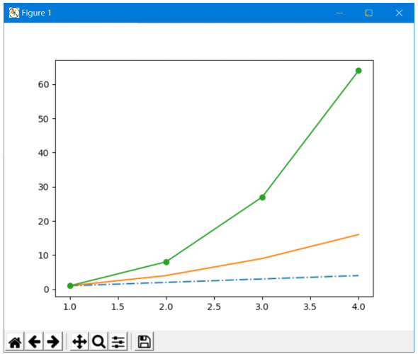
1.3. 点形控制
| 点型 | 类型 |
|---|---|
| ’.’ | 点 |
| ’,’ | 像素点 |
| ‘o’ | 原点 |
| ’^’ | 上三角点 |
| ‘v’ | 下三角点 |
| ’<’ | 左三角点 |
| ’>’ | 右三角点 |
| ‘1’ | 下三叉点 |
| ‘2’ | 上三叉点 |
| ‘3’ | 左三叉点 |
| ‘4’ | 右三叉点 |
| ’s’ | 正方点 |
| ’+’ | 加号点 |
| ‘x’ | 乘号点 |
| ‘D’ | 实心菱形点 |
| ‘d’ | 细菱形点 |
示例
1
2
3
4
5
6
7
8
9
10
11
12
13
14
15
16
import matplotlib.pyplot as plt

x = [1, 2, 3, 4]
y1 = [1, 2, 3, 4]
y2 = [1, 4, 9, 16]
y3 = [1, 8, 27, 64]
y4 = [1, 16, 81, 124]
# 创建一个画布
plt.figure()
# 在figure下的线
plt.plot(x, y1, "-.") # 点
plt.plot(x, y2, "-,") # 像素点
plt.plot(x, y3, "-o") # 圆点

# 展现画布
plt.show()
绘制效果为
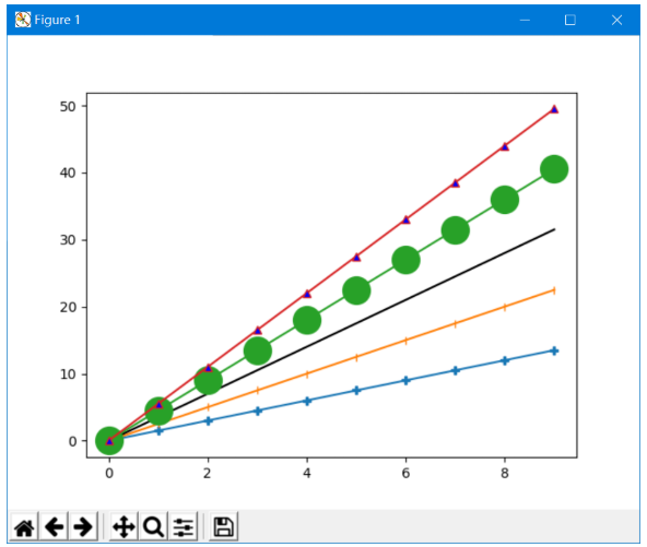
1.4. 另一种设置方法
color=”green” 指定颜色为绿色
linestyle=”dashed” 指定线形为dashed类型
marker=”o” 指定标记类型为o点
markerfacecolor=”blue”指定标记的颜色为蓝色
markersize=20 指定标记的大小为20
比如
1
2
3
4
5
6
7
8
9
10
11
12
13
14
15
16
17
import matplotlib.pyplot as plt
import numpy as np

x = np.arange(10)
y1 = x * 1.5
y2 = x * 2.5
y3 = x * 3.5
y4 = x * 4.5
y5 = x * 5.5

plt.plot(x, y1, "-P")
plt.plot(x, y2, "-|")
plt.plot(x, y3, color="#000000")
plt.plot(x, y4, "-o", markersize=20)
plt.plot(x, y5, "-^", markerfacecolor="blue")

plt.show()
2. subplot
有些时候, 我们希望把一组图放在一起进行比较, 有没有什么好的方法呢?matplotlib 中提供的 subplot 可以很好的解决这个问题。matplotlib 下, 一个 Figure 对象可以包含多个子图(Axes), 可以使用 subplot() 快速绘制, 其调用形式如下 :
1
subplot(numRows, numCols, plotNum)
- 图表的整个绘图区域被分成
numRows行和numCols列; - 然后按照从左到右,从上到下的顺序对每个子区域进行编号,左上的子区域的编号为1;
plotNum参数指定创建的Axes对象所在的区域;- 如果
numRows,numCols和plotNum这三个数都小于10的话, 可以把它们缩写为一个整数, 例如subplot(323)和subplot(3,2,3)是相同的(缩写便于循环); subplot在plotNum指定的区域中创建一个轴对象. 如果新创建的轴和之前创建的轴重叠的话,之前的轴将被删除。
2.1. 规则划分
示例
1
2
3
4
5
6
7
import matplotlib
import matplotlib.pyplot as plt
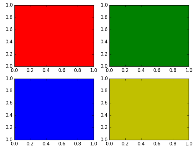
for i,color in enumerate("rgby"):
plt.subplot(221+i, axisbg=color) # 221 = 2,2,1
plt.show()
绘制结果为
2.2. 不规则划分
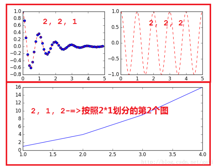
有时候我们的划分并不是规则的, 比如如下的形式
这种应该怎么划分呢?
首先将整个表按照 2*2 划分,前两个简单, 分别是 (2, 2, 1) 和 (2, 2, 2);
但是第三个图呢, 他占用了 (2, 2, 3) 和 (2, 2, 4);
因此,需要对整个图重新划分, 按照 2 * 1 划分;
前两个图占用了 (2, 1, 1) 的位置,因此第三个图占用了 (2, 1, 2) 的位置。
代码如下
1
2
3
4
5
6
7
8
9
10
11
12
13
14
15
16
17
18
19
20
21
import matplotlib.pyplot as plt
import numpy as np
def f(t):
return np.exp(-t) * np.cos(2 * np.pi * t)
if __name__ == '__main__' :
t1 = np.arange(0, 5, 0.1)
t2 = np.arange(0, 5, 0.02)
plt.figure(12)
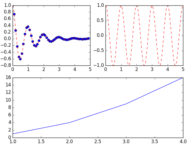
plt.subplot(221)
plt.plot(t1, f(t1), 'bo', t2, f(t2), 'r--')
plt.subplot(222)
plt.plot(t2, np.cos(2 * np.pi * t2), 'r--')
plt.subplot(212)
plt.plot([1, 2, 3, 4], [1, 4, 9, 16])
plt.show()
2.3. 二维三维混合子图
1
2
3
4
5
6
7
8
9
10
11
12
13
14
15
import matplotlib.pyplot as plt
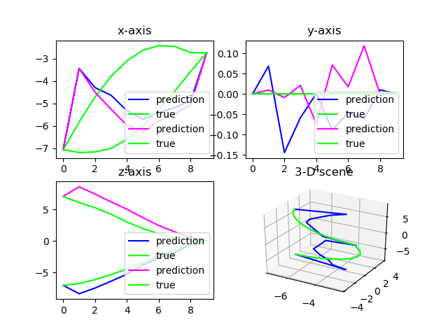
fig = plt.figure(1)
ax1 = fig.add_subplot(2, 2, 1)
ax2 = fig.add_subplot(2, 2, 2)
ax3 = fig.add_subplot(2, 2, 3)
ax4 = fig.add_subplot(2, 2, 4, projection='3d')
for i in range(100):
ax1.set_title('x-axis')
ax1.plot(ind, pred_x, label="prediction", color=(i,0,1))
ax1.plot(ind, outputs_x, label="true", color=(0,1,0))
ax1.legend(loc="lower right")
......
fig = plt.figure(1) # re-assign to figure 1 to refresh it
plt.pause(0.01) # leave some time for plotting finished
plt.show(block=False) # plot without blocking running
可以绘制两行量列的子图,其中右下角第四个图是三维图。
注意不要将上述代码置于循环中,否则会出现DuplicateWarning。
多次绘制在同一个figure中的效果如下:
2.4. 多图刷新
注意,如果有多张图需要同时刷新,需要按照如下的设计思路书写代码
1
2
3
4
5
6
7
8
9
10
11
12
13
14
15
16
17
18
19
20
21
22
23
24
25
26
27
28
29
30
31
32
import matplotlib.pyplot as plt
fig = plt.figure(1) # 在循环外定义包含多个subplot的figure 1
ax1 = fig.add_subplot(2, 2, 1)
ax2 = fig.add_subplot(2, 2, 2)
ax3 = fig.add_subplot(2, 2, 3)
ax4 = fig.add_subplot(2, 2, 4, projection='3d')

for i in range(100):
  ......[other codes]
  ax1.cla() # 清空当前轴
  ax2.cla()
  ax3.cla()
  ax4.cla()
  plt.pause(0.01)
  ax1.set_title('x-axis')
  ax1.plot(ind, pred_x, label="prediction", color=(i,0,1))
  ax1.plot(ind, outputs_x, label="true", color=(0,1,0))
  ax1.legend(loc="lower right")
  ......[other codes]
  fig = plt.figure(1) # 重新指定fig的对象为figure 1
  plt.pause(0.01) # 必须暂停短暂的时间以供绘图完成而不出现白板
  plt.show(block=False) # 刷新figure 1,且不阻塞

  figloss = plt.figure(2) # 指定fig的对象为figure 2
  plt.cla() # 清空当前轴
  plt.pause(0.01)
  plt.plot(iterNum, avgloss, '-o')
  plt.xlabel('iterations',fontsize=10)
  plt.ylabel('MSE',fontsize=10)
  plt.pause(0.01)
  plt.show(block=False) # 刷新figure 2,且不阻塞
- 在循环外定义包含多个subplot的figure 1,避免循环内定义报DuplicatedWarning;
- 单张图可在循环内直接定义和绘制(如figure 2);
- 循环内每次重新绘制时,需通过
fig = figure(x)指定相应的第x个图才能正确刷新。
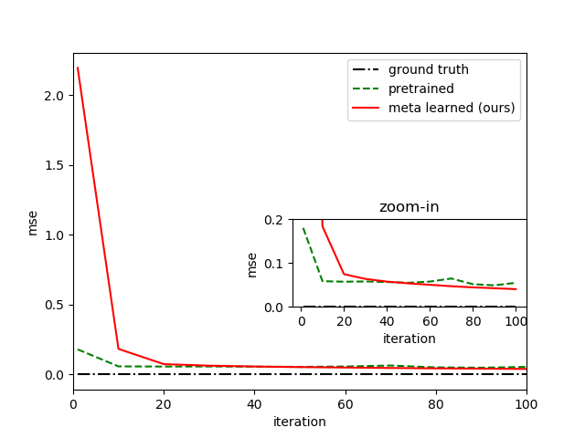
3. 图中图
代码如下
1
2
3
4
5
6
7
8
9
10
11
12
13
14
15
16
17
18
19
20
21
22
23
24
import numpy as np
import matplotlib.pyplot as plt

fig = plt.figure(1)
plt.plot(listiter_meta, ground_truth, '-.', label='ground truth', color="black")
plt.plot(listiter_meta, pretrained, '--', label='pretrained', color="green")
plt.plot(listiter_meta, meta, '-', label='meta learned (ours)', color="red")
plt.xlim(0,100)
plt.xlabel("iteration")
plt.ylabel("mse")
plt.legend(loc="upper right")

left, bottom, width, height = 0.5,0.3,0.4,0.2
ax1 = fig.add_axes([left,bottom,width,height])
ax1.plot(listiter_meta, ground_truth, '-.', color="black")
ax1.plot(listiter_meta, pretrained, '--', color="green")
ax1.plot(listiter_meta, meta, '-', color="red")
ax1.set_xlabel("iteration")
ax1.set_ylabel("mse")
ax1.set_title('zoom-in')
ax1.set_ylim(0,0.2)

plt.savefig('msecompare.png')
plt.show(block=False)
结果如下图所示
4. 清理绘图
cla() 函数可以清除当前figure中活动的axes,其它axes保持不变。
clf() 函数清除当前figure的所有axes,但是不关闭这个window,可以继续复用于其它的plot。
close() 关闭 window,如果没有指定,则指当前 window。